The objective of this texture was to make a wall surrounding a temple; things changed, and I began to think on a larger level of how to make basic textures for walls. The thing I learned is that, players will just run by most of the, hard made, designs. I began thinking about making more generic walls since players are going to be running right past most of the designs. Also, the concept of lighting became crucial to learn in order to guide the player towards key points in the (in construction) battle arena. According to the critiques of some professionals, I needed to make the faces more anatomically correct in regards towards making it a more human skull look.

This was another design for a column wall. I took the advice of a pro in looking at human skulls to design a more believable asset. I was taking this design very seriously as I planned on it being a key statement of the art direction of the battle arena; to make a very scary, satanic, and believable level that is new and fresh in a game.
This is a basic, non-handpainted, design made from textures found on the internet. This was made before making the decision to make the environment have a handpainted, fantasy style, overall design.
This is a very old painting made in school for a special topics class. It was suggested by my professor, Bruce Sharp, to make "more hard edges" in the painting. I believe he was suggesting to put some more, hard made, design work into the piece. This is a very difficult suggestion to integrate into the painting process; I believe that I, somewhat, understand what he was suggesting. I could make some kind of design for the walls coming out from the house; something like that.
This was a final image made in the class that determines whether or not you graduate to get your BFA. All that was suggested was to make my shadows soft. I began working on another project since I consider this piece to be, mostly, complete. This piece was made before I began thinking about playtesting assets in Unreal; assets look completely different in Unreal, even though it looks good in Photoshop or Maya. I have been using Maya for at least 10 years (2005).
This project was made on my own time. It is lacking all the maps except for the color/diffuse. Another project came up, and production on this asset stopped. I good specular map, put into Unreal, I believe, would make this asset look a lot more professional.
This was the first asset made for the Unreal temple I planned to make; having no clue that it was to go into a battle arena (which was just recently decided about 4 weeks ago) from a professionals suggestion.
This asset was made during a production class at The Art Institute of Seattle. I think an AO map would make it look better, as well as a spec map; however, I have lost the files for this car due to a virus on my firestorm drive; so it sits unfinished, yet, to a degree, could be considered, somewhat, finished.
This was a room for the same production class as mentioned above at AIS. It was never actually executed into the Unreal engine due to time constraints, but here it is. I think I have lost the files for this level as well due to a firestorm virus.
This is one of the final pieces that was built to go into my portfolio book. Again, it was suggested that I use soft lights and shadows to make it feel more complete and I agree, but, other projects came up, and I had to cease production on this asset. I might still have the files for this one, I am not sure. I have hundreds of files that are not properly named. Now, I know how important naming conventions are because of losing assets due to poorly named files.
I just chose something to build for the battle arena level on this one. It is none mudboxed, and all the sculpting was done in Maya using Maya sculpting tools and high res models. I am learning mudbox as I write this self-critique.
This is one of my favorite textures that I've made and looks good in Unreal 4. This is the style of texturing that I am currently pursuing; handpainted/stylized design look. Almost Diablo, almost WOW, but, not nearly both; sort of in its own dimension in between Guild Wars, Diablo 3, and World of Warcraft. This texture could use a good displacement, normal, and specular map; of coarse, completing my battle arena entails each asset be fully textured, normal mapped, displacement map, and a good look in Unreal 4.
This desk was the final product of a previous class. I think color theory could improve this asset, but I know nothing of color theory other than to use colors to guide the players through the level in a very skillful way that I have yet to discover. Hopefully, I will get some good advice later on.
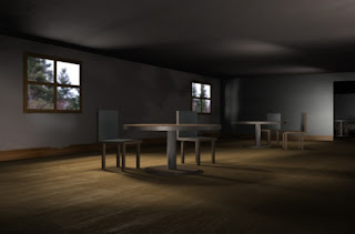
This project was built during a texture and lighting class taught by Tim Everitt; a former employee of ILM who worked on Pirates of the Caribbean as a visual effects, top level, advisor. The goal was to model the models with light. In a meeting, it was suggested that I "capitalize" on my lighting knowledge by focusing on lighting assets in the future to fit the standards of this level. I got an A on this project. You see the lighting on the ceiling there? Where does it come from? Who cares?! That is what I was taught. Hah. Hah.
This was a texture sheet that I made to sort of fit into the world of Pirates of the Burning Sea as a candidate. It doesn't quite fit the bill of being handcrafted, but I put a few weeks into the production of this asset sheet. I have been, recently told, to not fall in love with your work by an art director named Jack Snowden. Production on this sheet was stopped, and I began working on another project. :(
This asset was just to show that I can work from a concept artist's work. I think the sculptural look of the bottom face could be more defined and the roofing more loosely made to look more dimensional; that is, to actually go in and make more geometry around the roofing the make different parts of the roof stand out, not exactly a normal/displacement map, but it would make this piece look better.
This was just a piece I sketched on a car ride. The finished product (rendered image) was lost. I focused this piece on being post-apocalyptic. I think the soldier's left leg could be brought in a bit more.
This is just another asset I made in my free time that found a place in my battle arena. I actually found the files for this piece in my firestorm and imported it into Unreal 4; for the arena to look more cultural.
I made this piece quite a long time ago. It was for a movie production class where the main storyline takes place in the animation. I built it out of a thumbnail and some random photographs I took, while living in Seattle, to help make this image. Since this image, I have never really gotten back towards this style of asset production. It was suggested to put black all over the place and increase the lighting effects on the door.
This is just one of the walls in the battle arena that I became satisfied with; it looks handpainted, minimal photo use, and strong cracks and highlights around the stones. A good normal/displacement/specular map would make this piece look very much better.


